
MyChart Redesign
During the pandemic, UCSD students find it difficult to grasp vital COVID-19 information and services in the MyChart App, increasing the anxiety under the context of limited access to on-site medical facilities.
Overview
MyChart is a comprehensive medical portal used by UCSD health to provide direct access to medical record and facilitate communication between students and their healthcare providers.
The core redesign focuses on the information accessbility so that UCSD students can easily locate the services and resources related to COVID-19 when needed.
Role
UX/UI designer
User research, UX flowchart, lo-fi wireframing, user testing, interaction, hi-fi prototype
Tools
Figma
Client
UCSD Health
Duration
January 2022 - May 2022
Collaborators
Xiangwen Li, Ruijie Huang, Chia-yu Chang, Jinyu Rao
The problem
How can MyChart help UCSD students stay connected with the available COVID-19 related resources?

"I have never been so stressed in my college life."
Jeremiah is an imaginary UCSD third-year student in our persona. After returning to California, he notices two of his roommates showed Covid symptoms, and one of them tested positive. While Jeremiah just received an in-person internship offer, he worries what if he’s infected as well.
Will Jeremiah lose this valuable opportunity?
With the urgency to get tested, he finds out the waiting line in the UCSD Student Health Center is too long. He can’t spend all day waiting in the line because he has classes to take. Jeremiah’s anxiety to lose his internship overwhelms him. He needs some immediate professional help.
Jeremiah isn't the only student feeling frustrated and directionless. Alleviating students’ stress caused by the pandemic, our redesign targets two main tasks
Stay updated with the availability of self-test kit and testing locations
Deliver guidance on actions individuals can make while waiting for COVID-19 testing availability
User Research
In order to evaluate the performance of MyChart's navigation and ease of use, we used semi-structured interviews and surveys to conduct user research on 64 UCSD students.
While 57% participants are using MyChart to get information about COVID-19,
56% of them couldn't locate the desired COVID-19 info within a few taps,
63% of them were overwhelmed by the comprehensive services when selecting the right one.
Why does the navigation process complicate information searching increasing UCSD students' stress?
3 Pain Points

Scattered COVID-19 information
It’s challenging to recall the specific feature entry linked to a particular resource. COVID-19 info is everywhere.
Cluttered info layout
Key info buried under less relevant content, complicating navigation.


Lack of access to the alternative testing option
There are self-test kits available in the vending machines across the campus, but students are unaware of how many kits are left unless they go check it out.
In response to these challenges, I created a flowchart that outlines a streamlined navigation path for accessing COVID-19 resources.

Idea Validation
Before designing the final product, we want to validate our ideas. We conducted A/B user test in the lo-fi wireframing and the original interface using the semi-structured interview on 10 UCSD students. Here's what we found.
The dashboard, featuring the Visits section, allows users to quickly schedule appointments if they know what they need upon opening the app.
Once users explore the path of COVID-19 section, they are more likely to make a decision on scheduling a COVID-19 test or vaccine after viewing their COVID-19 Test Results and COVID-19 Vaccination Record, especially if they question their COVID-19 test accuracy or notice an upcoming COVID-19 vaccination due.
Therefore, the option to schedule has been strategically placed after users view their COVID-19 test results and COVID-19 vaccination details for convenience and efficiency.

Product
Based on the usability testing, we created high-fidelity prototype in Figma. The original interface and the hi-fi prototype are presented below.
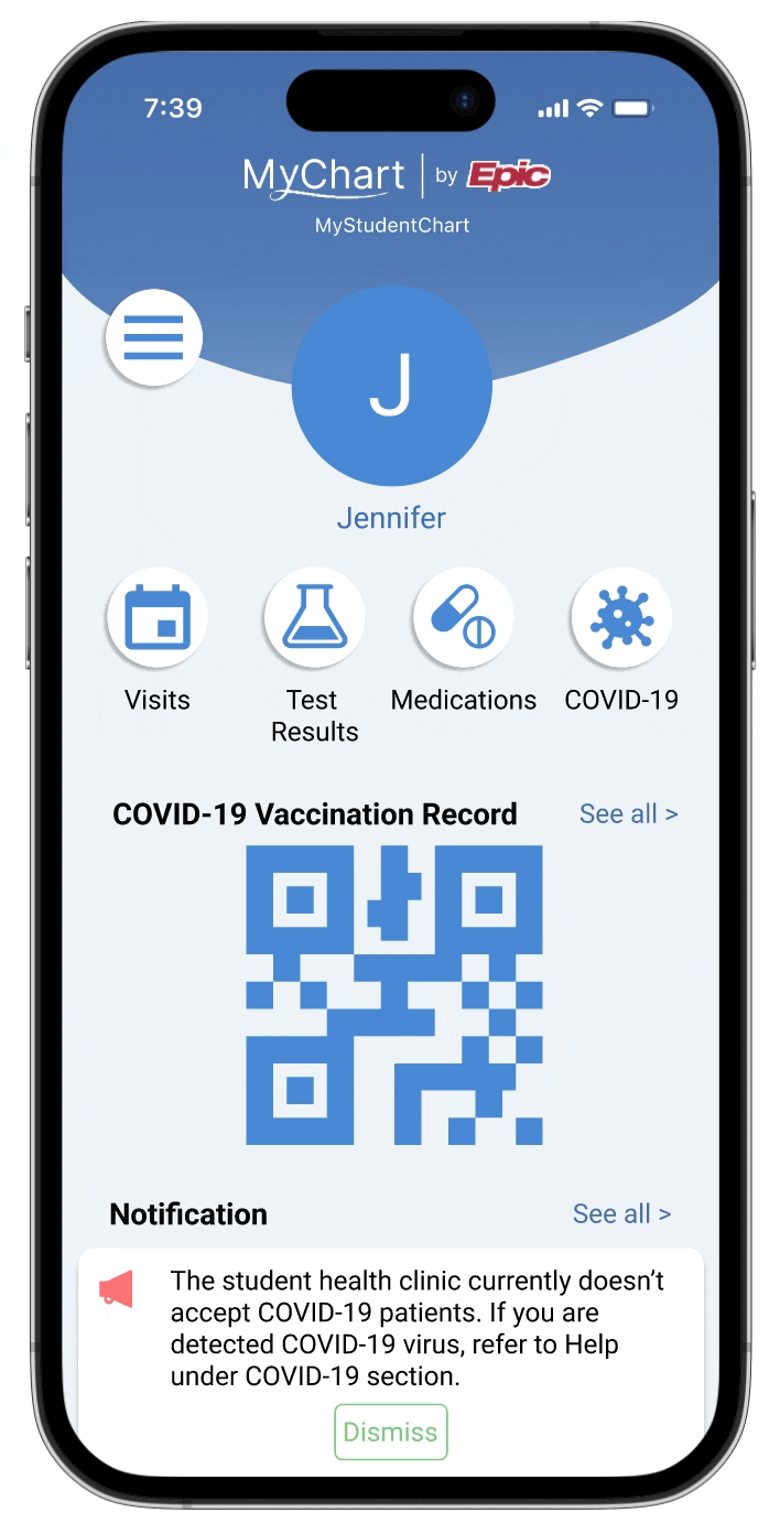
Home
One tap to COVID-19 section. Scan COVID-19 vaccination QR code right away. View important update and message from care providers. Less distracted by the unrelevant content.
COVID-19 Section
Preview COVID-19 vaccination and test result. Follow care instructions based on needs.
Appointment Making
Less distracted by different types of appointments.
Reflection
This was my first UX design project, and like many new UX designers, I made a common mistake. I focused a lot on the design aspects and prone to overlook practical constraints such as technical limitation. This taught me a crucial lesson: effective UX design wasn't just about creating visually appealing and user-friendly interfaces; it also required a thorough understanding of the practical aspects that influenced the feasibility and success of a design.