
HealthyPlan.City Mobile Design
Without a mobile-friendly interface on HealthyPlan.City, urban planners, public health professionals, policy makers and community organizers are facing challenges to pinpoint areas on-the-go where need to put efforts and enhancements in the local environment for addressing environmental injustices, fostering public health, and facilitating adaptation to climate change.
Overview
Although HealthyPlan.City was developed less than a year ago, it had started exploring ways to expand its reach to wider audience, aiming to raise awareness of how community design impacts health.
The goal of this project is to adapt the existing website into a user-centric mobile interface that seamlessly bridges the gap between desktop and mobile use.
Role
UX/UI designer
User research, journey mapping, mi-fi prototype, user testing, interaction, hi-fi prototype
Tools
Figma
Client
HealthyPlan.City
Duration
January, 2024 - June, 2024
Collaborators
Xiangwen Li, Jingjing Wang, Jingyi Zhou, Minxian Wu, Shangxia Zhou
Background
HealthyPlan.City is a first mapping tool that targets the integration of environmental health data with urban planning specifically tailored for Canadian cities. Learn more about what HealthyPlan.City does.
Before HealthyPlan.City reached out to us, they had developed and implemented a website that can be only accessed through desktop devices. When the website was developing, the responsive design wasn’t on the scope of the work. Given the current limitations of accessing the website, HealthyPlan.City is looking to develop a mobile version to complement its existing platform, allowing users to engage with the platform's features and data anytime, anywhere. This is also a part of HealthyPlan.City's commitment, in order to raise awareness of how community design impacts health.
Understanding the Problem
How frustrated can be when urban planners can't find the source they need during an off-site meeting?
Let's take a look at Alex's story.
Alex Chen is having a meeting with colleages at a cafe to discuss urban health topics. When Alex opens HealthyPlan.City on his phone, a message popped up in the browser, making him frustrated as this is unexpected.
To make his arguments more solid, he explores other sources but none of them provide specialized data via the lens of environmental building.
Feeling anxious, as all of Alex's colleages are waiting for him, Alex tries to discuss the air pollution issues based on what he remembers.
This meeting doesn't run long as Alex hasn't fully prepared to present his thoughts and findings. Alex decides to contact HealthyPlan.City about the mobile site issue. He wishes one day he can integrate mobile technology into all aspects of his work.

"I hope I can recall the data accurately." (Alex).
Researching
To understand our user's pains, my teammates and I found 11 participants and divided into 2 groups: a primary user group of professional user (group 1) and a secondary user group of general user (group 2). This participant groups setup was to understand the different interaction style for shaping a more inclusive and user-friendly mobile experience. We included general users in the research to align with HealthyPlan.City's strategic objective of attracting a broader audience through enhanced mobile accessibility.
I then conducted user research using semi-structured interview on group 1 to understand how users interact with the platform and identify their specific needs, preferences, and pain points.
After collecting all the scripts and notes, we found that:
45%
45% of the participants, predominantly the group 1, worried that including all features from the website may conflict with the goal of creating a clean, user-friendly interface for the mobile version.
63%
63% of them, predominantly from group 1, found the community section to be less engaging than expected that they couldn't catch up with what's going on in their community.
36%
36% of them, predominantly from group 2, felt confused when interpreting the data.
“Challenges will be deciding which features to draw” (P1).
Prioritizing Ideas
To address the pains and challenges of our users, my teammates and I crafted some initial ideas and prioritized them using the impact-feasibility matrix. We determined the impact and feasibility using these factors:
Impact
-
To what extend an idea ease the pains.
-
The alignment of the idea with HealthyPlan.City's strategic objectives.
Feasibility
-
Whether the necessary data is available.
-
Time and budget required for implementation.
We consulted with the developers and managers to understand their timeline and budget constraints and plotted our ideas on the prioritization grid.
Using the prioritization grid, we came to the conclusion that incorporation of contextual help adhered the jargon or data has the highest priority, followed by reorganization of the content layout making seamlessly swifting user experience. These adaptation approaches are essential to recognize the original user pathways for existing users and reduce cognitive load for new users and general users.
.png)
Crafting the First Solution
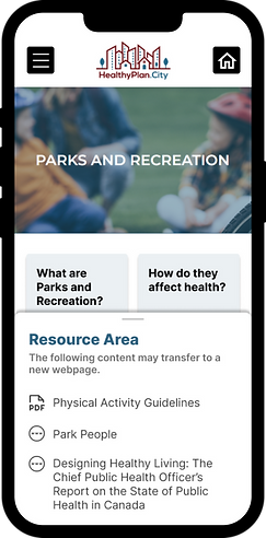
After balancing the values of functionalities and their feasibility, our team, incollaboration with HealthyPlan.City team, opted for keeping certain features from the website and delayed the development of community section redesign. These features are: tutorial guidance, contextual help, mapping, and documentary resources.

Promoting Effective Usage
Providing an onboarding tutorial to guide users through the steps of using the app
Decreasing Learning Curve
Integrating contextual explanation with freedom to reveal after one tap


Maintaining Consistent Experience
Applying UI patterns to effectively display information overlays
Validating the Design
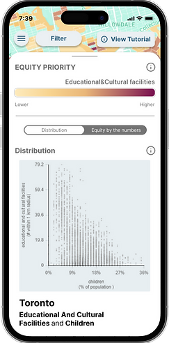
My teammates and I created two scenarios for the usability testings with our primary users. These scenarios ask users to search for the proportion of children and educational facilities to plan where to build more schools and find available guiding resources on the app when feeling lost.
We didn't include our secondary users at the testing sessions as many ideas to address their needs have low feasibility. I then conducted usability tests with half of the participants to ensure they can easily recognize and interact with key features of the application.
After collecting all the notes, we found that:
-
All necessary information displayed within the same screen helps users follow consistent steps to complete their tasks.
-
Some UI elements have not been optimally designed, resulting in their colors or positions blending into the background and causing confusion for users.
-
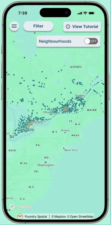
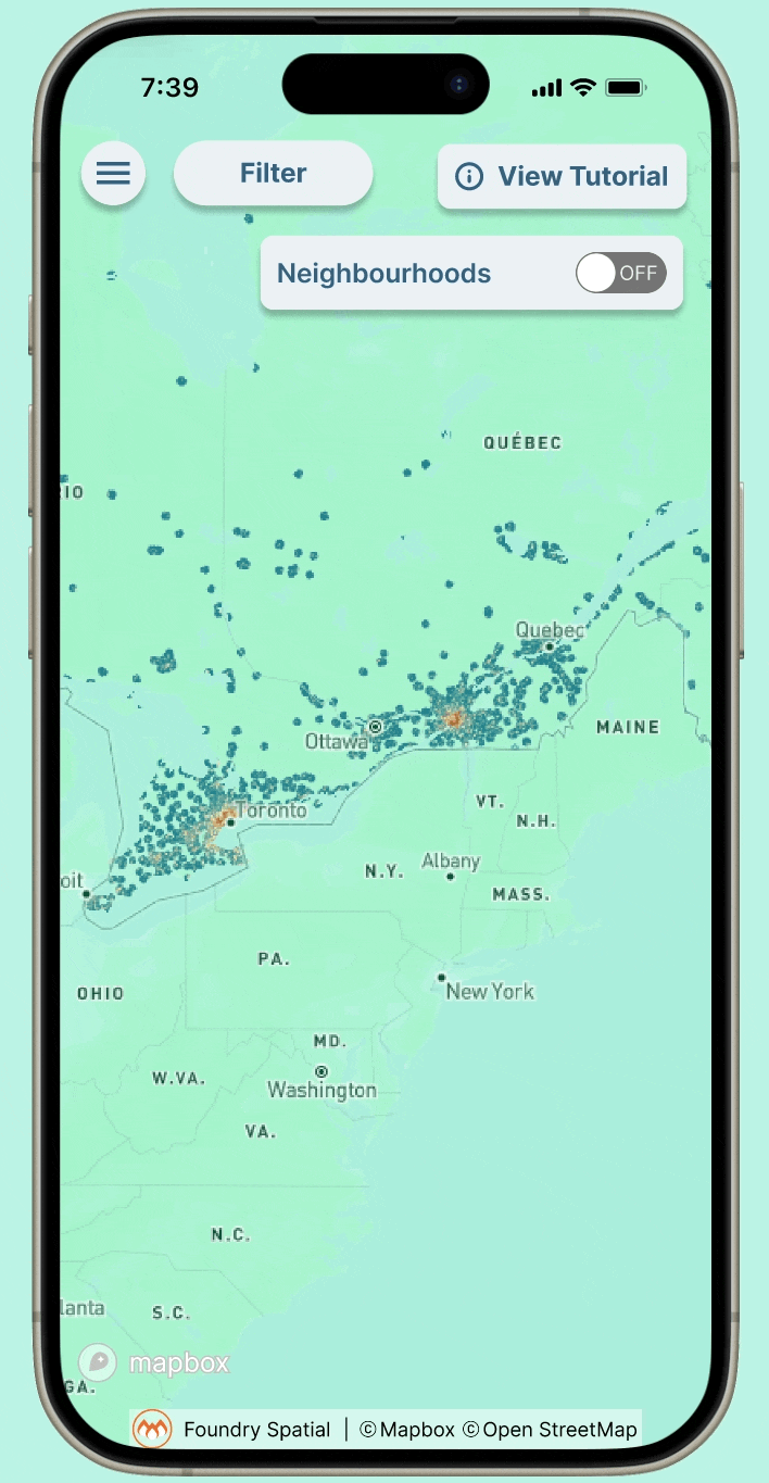
The cluster of UI element at the top of the screen obstructs the map, making it difficult to clearly see neighborhood details.


Iterating the Solution
Based on the findings on usability sessions, I created the high-fidelity prototype in Figma. To enhance user experience, I added the interactive animations in the Figma prototype by providing smooth, intuitive interactions and clear visual feedback, making the app more engaging and easier to navigate.

Reflection
Although many ideas addressing user pains had low feasibility due to time constraints from the developers, these ideas will be considered for future development.
In this project, I have learned:
-
UI Elements are powerful to convey meaning visually. Focus on visual clarity and effective placement.
-
Use interactive animations to provide smooth, intuitive interactions and clear visual feedback. This makes the app more engaging and easier to navigate.
-
Collaborate closely with developers, managers, and stakeholders. This ensures alignment and facilitates informed decision-making for a cohesive final product.