
KDO Webpage Innovation
International students often face significant challenges when trying to identify and apply to the right educational programs. Choosing to become an international student involves careful consideration: it requires time and effort to plan the budget and evaluate the potential outcomes to determine if it's desirable.
Overview
KDO platform is an education service designed to help international students discover study programs in Canada that fit their long-term academic aespirations and career goals, by providing resources and support on application, life adaptation, personal development, and cultural integration.
Role
UX/UI designer
Competitor analysis, information architecture, typography, logo design, low-fi wireframing, hi-fi prototype, interaction
Tools
Figma Figjam
Client
KDO
Duration
January, 2024 - June, 2024
Collaborators
Xiangwen Li, Jingyi Zhou, Xinyi Gao
Understanding the Problem
KDO is a Turkey-based international education agency that currently lacks online presence to marketing and outreach. Originally, KDO had an official website that showcased its partnered language schools and offered contact information, but this website was taken offline in 2014 due to its inability to offer any strategic advantage in engaging with potential clients and attracting more students.
To explore potential issues that prevented KDO from meeting its business goals, my teammates and I had a brainstorm session reviewing KDO's obsolete website. We observed that:
-
List partnered language schools under each program category. Users may spend extra time reviewing each school individually.
-
Use poor color choices and low-quality images. This website aesthetic demonstrates unappealing layout, damaging the branding building.
-
Provide limited content with link of external schools. This setup might encourage users to apply directly through the schools, bypassing KDO to save on additional costs.
Analyzing Competitors
Given that KDO's previous website was last updated in 2014 and had since been taken offline, our team had chosen our observations of the outdated site as a starting point. Due to our limited capability to access and recruit our target demographic of Turkish international students, we were unable to conduct user research for this project.
Recognizing our limitations, my teammates and I conducted competitor research individually on 3 UX dimensions: navigation, visual design, and content. The goal of this competitor analysis was to set a direction for KDO's website innovation by understanding user expectations and learning from our competitors' practices. After synthesizing our notes, we found that:
Design Trends
-
Categorize types of program under program rather than study locations with various course options.
-
Implement a structured, consistent layout, including content with clear visual hierarchies to ensure navigation cues are immediately apparent.
-
Incorporate many high-quality images of happy students as well as videos to establish an emotional connection with potential clients.
User Expectations
-
Users prefer to browse educational options by program type rather than by institution.
-
Users anticipate a seamless and intuitive online experience, which influences their perception of a brand’s reliability and attention to detail.
-
Users expect to visualize a positive and transformative experience as a key motivator in the decision-making process.
Defining Goals
Based on the findings in competitor analysis, we narrowed down the problem space with these key goals:
-
We want users to spend minimal steps to find the desired information.
-
We want users to recognize KDO as a professional and reliable agency that provides expert guidance for studying abroad.
-
We want users to envision what life can be if studying aboard.
Information Architecture
To make information searching efficient, my teammates and I restructured the information architecture by reviewing all content on KDO’s previous site. We created an affinity digram to identify patterns of the original navigation items.
Beyond reorganizing the overall site's information architecture, we also noted the content topics in each webpage in the affinity diagram as bullet points to guide our content creation strategy.
The main change we did was grouping study category by program type, as students had a clearer understanding of program categories than of individual language schools. We also synthesized various webpages that provided similar content and moved the webpages' contents that showcased our client's value and objectives to the home page.
Before

After

Defining Content Strategy
Before wireframing our platform, we prioritized defining the information hierachy for each webpage. Given that our client partnered with 13 language schools, each with its unique placement rules and arrangement, we recognized that presenting detailed information of each programs may include a lengthy text, overwhelming users when reading.
I opted for a strategy based on top-down information processing by highlighting the key values and benefits of KDO's learning programs. This was inspired from a competitor known for handling similar complexity effectively. This competitor, operating on a large scale, emphasized the distinct features and benefits of each program, a practice that stood out from smaller competitors.
During this design process, we encountered challenges in obtaining current data points due to the slow response rates from KDO, so we had to rely on data from KDO's previous website to determine the topics of content. In particular, we chose to incorporate images that aligned with the content to illustrates the positive experience students can expect if they choose KDO as their agency for studying abroad. Here are the key components of content in the main pages:
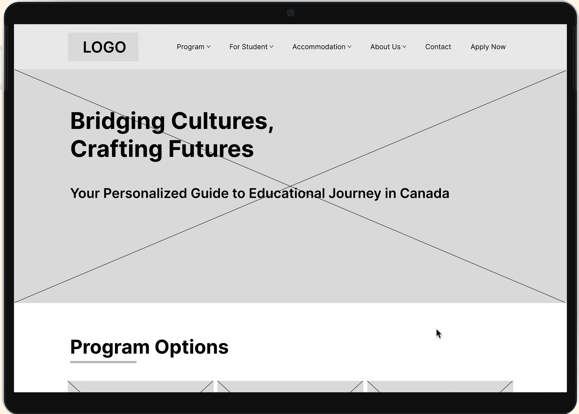
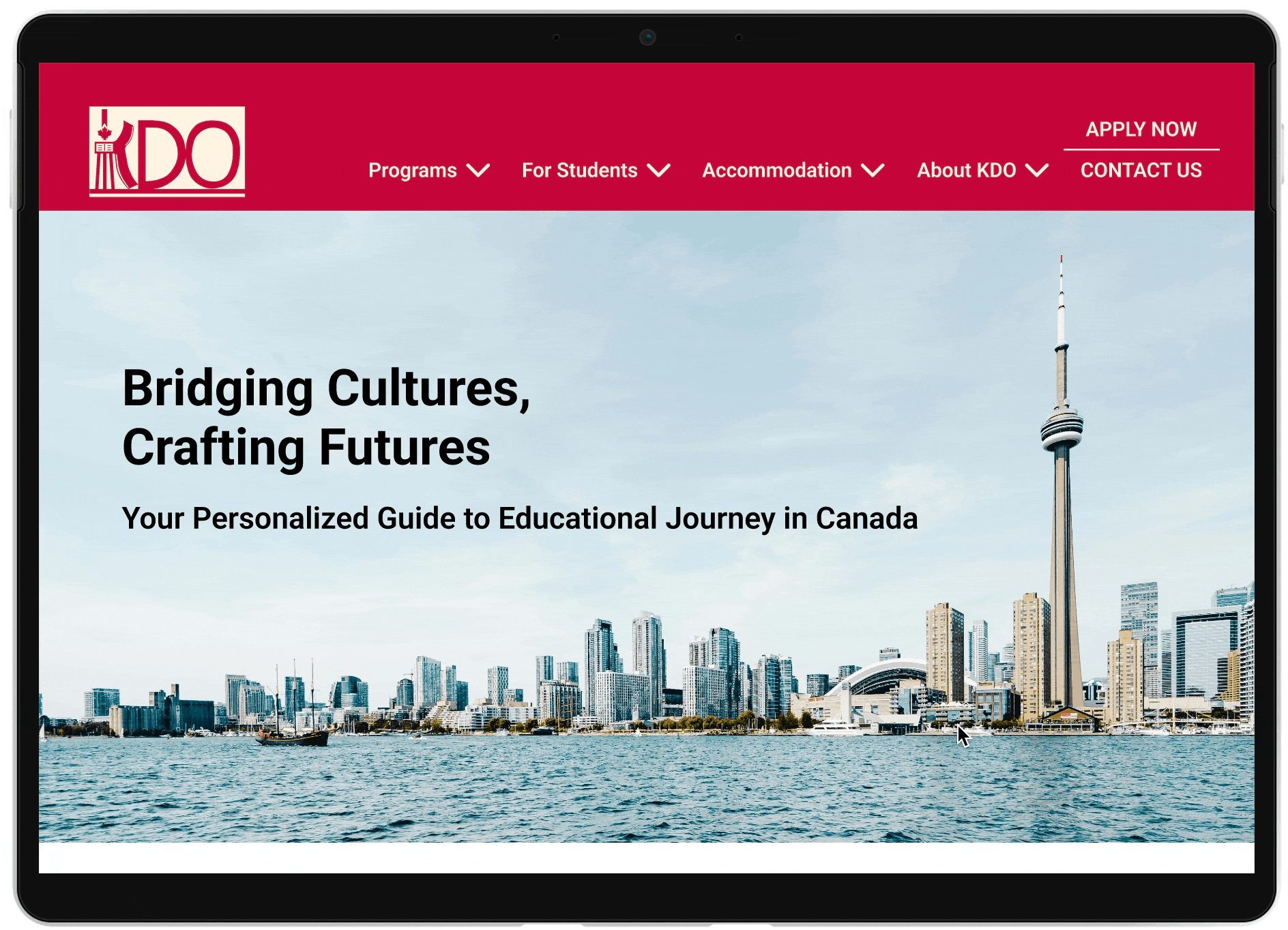
Home/Landing Page
An engaging introduction to KDO’s services. Introduce the benefits of choosing Canada for study. Deliver organization's role and mission. Dynamic calls-to-action that guide users to learn about accommodation options or start the application process immediately.
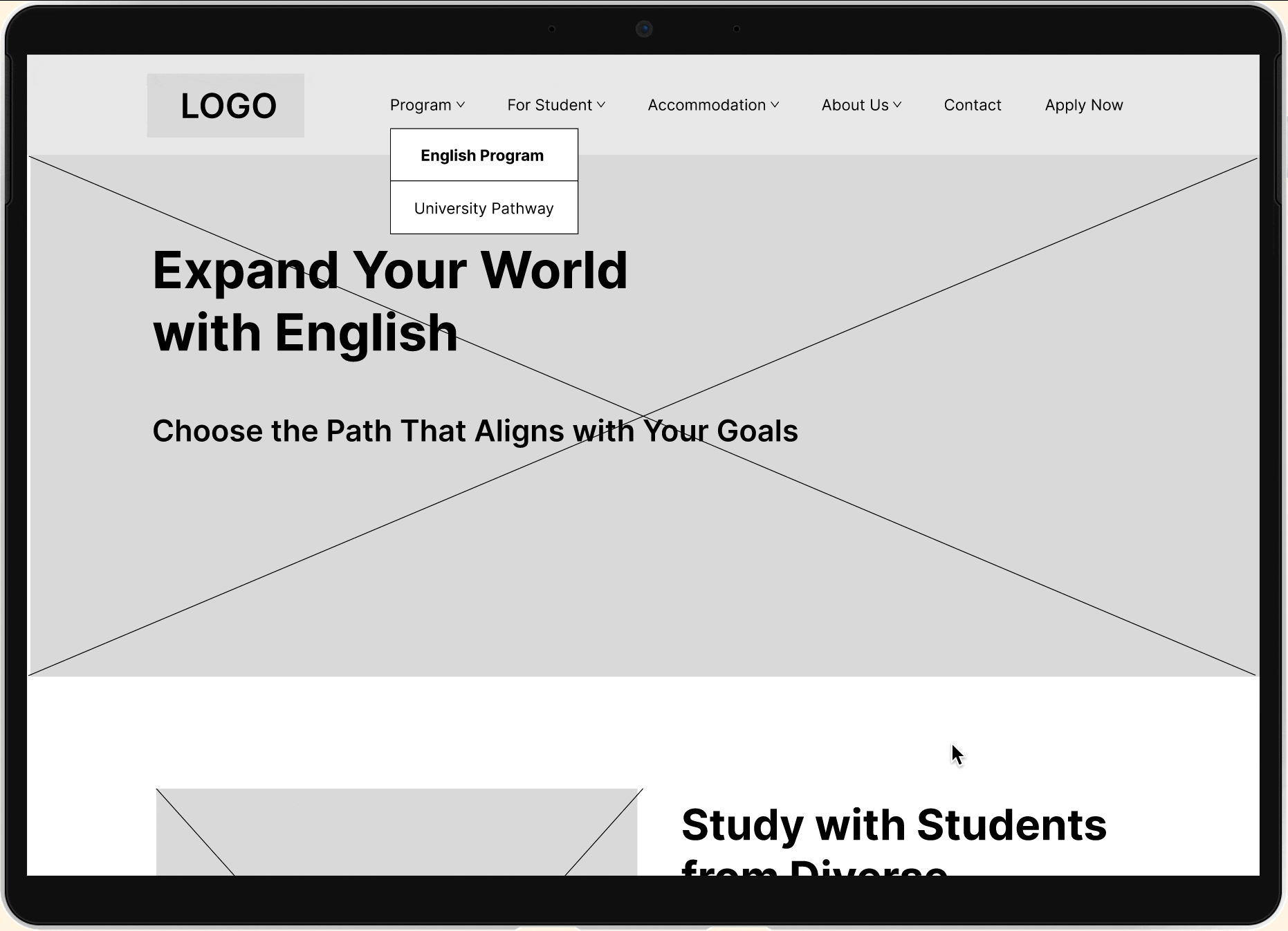
Programs
Emphasize the benefits of a prgroam. Provide a grid of the comprehensive English courses for exploration when needed.
Standardizing Design System
To establish an expert image in the digital realm, our team focused on standardizing the UI elements across our platform as the initial impressions users form when interacting with the website significantly influence their perception of one's professionalism and reliability.
Initially, our competitive analysis did not focus extensively on our competitors' font styles and color schemes. However, as we delved deeper into the analysis, we realized the importance of building consistent experience across all sites. Observing that our competitors had standardized their styling and UI patterns to achieve this consistency, we understood the need to similarly enhance the visual organization of our website, which acts as a digital representation of our client. We then revisited our competitors to specifically examine how they manage their styling and UI patterns.
Typography
After noticing a trend towards sens-serif fonts among our competitors, we chose Roboto for its readability and widespread recognition.
Color Palette
Influenced by our competitors' harmonious color schemes, we selected maple red along with bright pinkish-red, dark navy blue, and very light cream, in collaboration with KDO representatives, to create a combination of bold and subtle tones.
Logo Design
When designing the logo, the goal was to incorporate iconic elements that users would immediately resonate with Canada. To achieve this, I integrated the CN Tower, a maple leaf, and a bookmark into the design of the letter 'K', crafting a distinctive monogram logo.


Benchmarking the Design
Due to resource constraints, direct user testing between the low-fidelity wireframe and high-fidelity prototype stages was not feasible. We grounded our design decisions in established UX principles and benchmarks from similar successful platforms. We each identified design elements that failed to meet these benchmarks and then compared our findings. Here are the key changes:
-
A grid layout to display course options may overwhelm users due to the sheer volume of choices. To simplify the decision-making process, I adopted a card slider that revealed key information upon hover.
-
The program fees design was consolidated all pricing into a single table and removed filters and subnavigation. This decision was driven by the goal of improving user clarity and efficiency.
Before


After


Design
We opted for building a energetic and vibrant feel with the visual elements defined earlier in the high-fidelity interactive prototype in Figma. While this project encompassed multiple webpages, my contribution focused on designing homepage, programs, and program fee. I also created a component library with 9 components to maintain consistency for future development, and added interaction to enhance user engagement.
Home
Introduce main services right away. Include CTAs to deliver KDO's value and support.

Program
Provide unique features of different programs to guide the potential clients. Avoid showing too much info at once. Hover to reveal additional information of each features when needed.
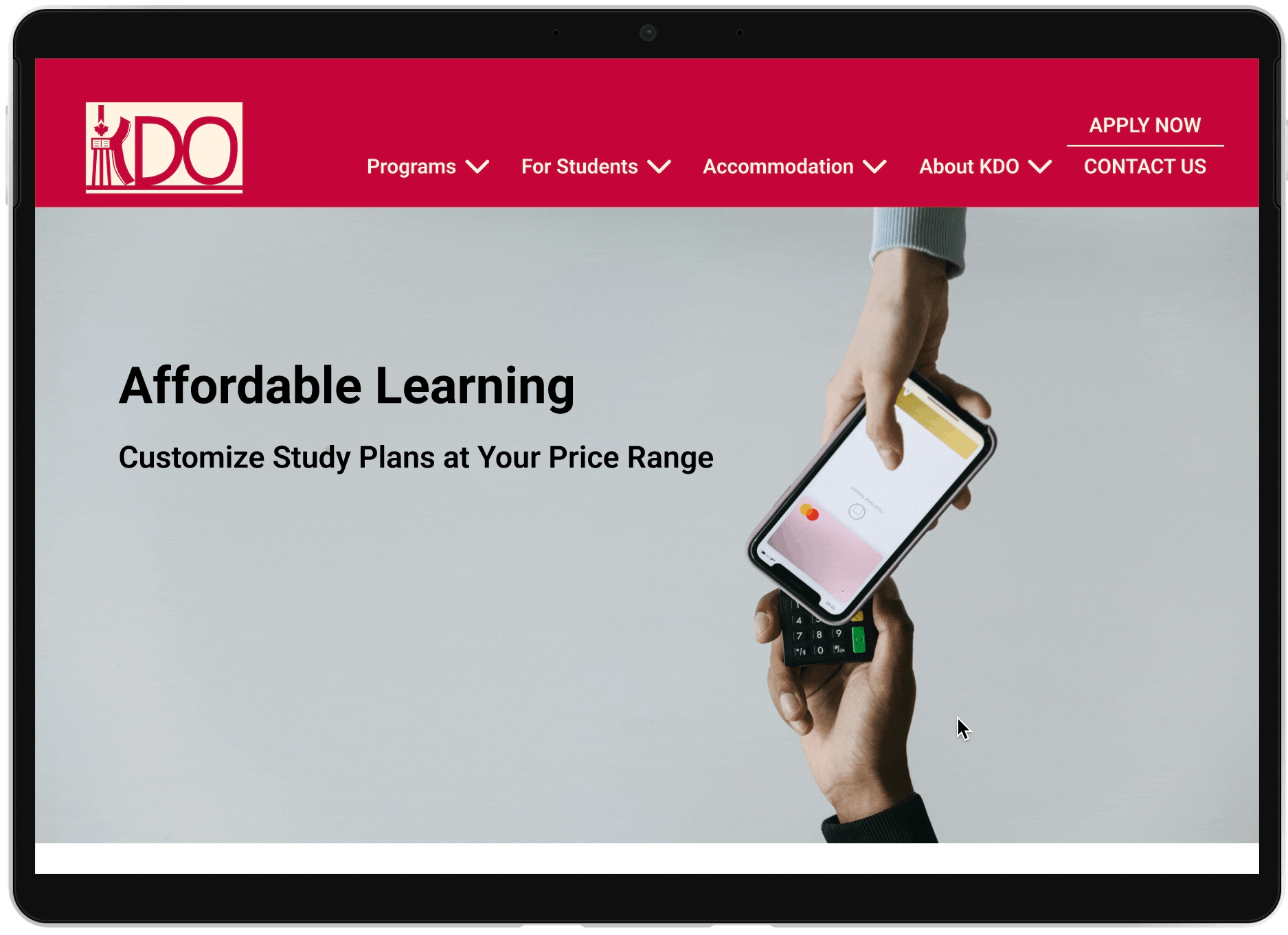
Program fees
Include a range of fees to increase transparency. Support potential clients to be aware of approximate cost before making decision. Hover animation to indicate the user's focus.
Reflection
After submitting the high-fidelity prototype, we received feedback from our lead that our prototype was highly reusable for future development.
In this project, I have learned:
-
Learn from others. In the absence of direct user research capabilities, I discovered the power of competitive analysis as an alternative method to gain insights into user behavior and preferences. Although competitor analysis couldn't replace the effect of user research, it was an alternative approach to help me move forward.
-
Keep logo design simple yet creative. This was my first logo design, and my first version was too complex as I tried to include as many elements as possible. After realizing this, I went through several online resources on logo design principles, which emphasized simplicity and clarity. Guided by these principles, I streamlined the design to focus on the essential elements, significantly improving its effectiveness and visual appeal.
-
Manage schedule with clear deadline. I had a sponsored course project going on when being an intern in Mojo Design Agency. To effectively handle both commitments, I prioritized tasks, set clear deadlines, and regularly reviewed my schedule to ensure I met all project milestones without compromising the quality of work in either role.